Hey guys,
How are y'all doing? I was pretty wrecked this morning. I couldn't work go to work today, my stomach took care of that. For the first time in months I went all out, drinking a lot of booze and dancing like hell. Damn, my body feels like shit but in my mind I'm happy and relieved.
We did it, guys! We didn't disappoint. I'm really proud of you guys and of course of our game, Tiki Island Adventures 2! Now we can go pick the fruits of our labor. We had our highs and lows, but in the end, it all came together. I'm looking forward to work with you again, the chemistry is there!
Above are some shitty pictures that Joeri took (this guy really needs to learn how to take pictures) during our presentation. BEER YEAH!
zaterdag 6 juni 2009
zondag 31 mei 2009
Impression 1st scene
http://student-kmt.hku.nl/~bram9/Render.rar
So, here's a link to the render of the 1st scene. It's not much, a bit low res but it should give a good idea of how it'll look. Enjoy!
vrijdag 29 mei 2009
Props... can't see that shit anymore
Hey there guys,
Finally finished the goddamn props... sorry for the language but I found out making these things to be quite redundant after a while. But! I'm rather pleased with the endresult, especially after the texture treatment with some smudge. It gives the drawings more life.
Bram, I'll send these asap to you!
Hope you like them!
woensdag 20 mei 2009
side of boat finished!
Hey dudez,
I made this final sideview of the boat. As you can see I started real roundish, but it didn't feel Tiki enough. So I made it edgier and that did the trick. I like the combination of big tikihead and croc heads!
Next to that I also made some other decisions, like ditching the sideview heads. Why? Well, you don't really see them in the game cause of the 2d sideview and it's just more modelling work for Bram and me. They'll get a nice texture with a Tiki head on them, but that's it. This will give us some more time for the character.
p.s= sorry for the horrible colors on that last boat... I just felt like it :P
dinsdag 19 mei 2009
Styleguide V2.0
Final boat thumbs + shit bitch!
Visual language
maandag 18 mei 2009
Animation Style
Hey Guys,
I talked to bram about the animation sequence and that we need to decide on if it's going to be 25 or maybe 30 frames per second due to memory allocation and the size of the images that need to be loaded in XNA.
The thing is that the animation will have a different feel to it when it is rendered out in 25 frames instead of 30. So therefore we need to think about this first.
Ofcourse we can use the same style of animation but I think that it will be blunt if we just decided that rendering it out on 25 instead of 30 "works just as good".
It doesn't...
Why? Because I will feel very hurt if we did think about this very lightly. We designed EVERYTHING, and this part which is the icing on the cake regarding to the visual style is left to faith on "whatever works out for us in XNA".
I personally looked up some animations on youtube and found one that I think really fits well with our design. Also there are some aspact in this particular animation (like the water) that looks great without much visual effects and knowledge of animation. Here's the link.
It has alot of fast movements in it. I personally like this since you don't have to get down to detail to much and it increases the dynamic. Also I have the sensation that it raises your awareness since the movements are so fast that you're constant aware of what happens on the screen.
If you can find other kinds of examples, please do! And please comment on this post and speak your mind!
Boot thumbs
Tiki Visual Style
Alright dudes, after this afternoon's meeting I did some searching on the internet. This is one of the first posts I'll do concerning this subject. I'll just try to post as many links as I can:
http://www.ancienthuna.com/symbols_pics.htm : This site might have some very interesting symbols we can use throughout the ride.
http://en.wikipedia.org/wiki/%27Elepaio : A very interesting little creature. A flycatching bird (Scene 1???) that's said to help the canoe builders pick trees (Scene 2???) they use for building that canoe.
http://polynesiandesign.net/symbols.html : Polynesian symbolism
http://en.wikipedia.org/wiki/Hi%27iaka : A hawaiian goddess who amongst other things caught souls
http://en.wikipedia.org/wiki/Pele_(Goddess) : A hawaiian goddess of fire, lava and volcanoes... Scene three anyone?
Aside from these links I found out there's hardly any religious art or symbolism, or even a visual language distinctive for the Polynesian culture... Maybe we can fix that up ourselves... I'll have to speak with Tom... Also, we could start working on a next script.... See you guys soon.
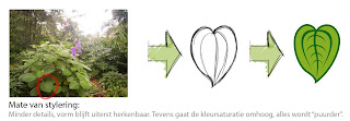
Stylization: how far will we go?
Here's an example of the matter how far we will go with the stylization. The form of leaves for example will remain in contact, but the colors shall be more saturated, more exxagurated. Also the detail level of the "vains" will go down, resulting in a more clearer and cleaner vision. This way the player won't be bothered with lots of unnecessary details and the characters will jump out!
zaterdag 16 mei 2009
Mock-up in 3D
Alright, so here's the mock-up I've promised all of you. Took me damn long enough to get the camera to follow the cilinder AND turn with it as well, but ofcourse as always the answer was so damn simple it made me cry,
For some reason the background isn't changing colour the way I had intended, but I'll fix that before the monday meeting.
woensdag 13 mei 2009
I like bush, yeah... wait, what?
dinsdag 12 mei 2009
styleguide part II: Acts
maandag 11 mei 2009
Styleguide begin and motivation
donderdag 7 mei 2009
Script, bitches!
Hey dudes,
hieronder dan eindelijk het script.
De dingen tussen blokhaken zijn gebeurtenissen, de stukken tussen aanhalingstekens zijn gesproken tekst en het cursief gedrukte is player experience.
----------------------
Script Going for a Ride
Scene 1
[Player sits in a boat, gently moving downstream while moving past a statue of Corné, a voice seems to come from the statue.
“For centuries we have slumbered... And now you have awoken us. We are the gods of the world you have entered. Many perils lay ahead of you, choose wisely and you will be richly rewarded. But beware, any foolish decision will cost you your life! Once you begin your journey down this river, you will be faced with the ideas and knowledge of the gods, caught forever in the form of fireflies. Catch them and savour their knowledge.”
[Player heads into the jungle, the ride flows quite slowly but does pick up a little in pace. Keyword here is flow. No hard turns or steep drops. This is the part where the fireflies enter the game, the player will have to catch them. A word appears on screen, accompanied by a deep voice that says “CATCH”]
You find yourself on a quick, but calm flowing river, winding through a jungle. All around you swarm fireflies in different colours. In your hands you hold a gun-like vacuumcleaner with which you can suck up the fireflies and store them in a container. The area around you is lush and green, junglesounds fill your ears as you travel down the winding rivier, catching fireflies as you go.
Then all of a sudden...
[BOOM! A huge, stone head drops down and crashes in front of the player. The ride halts for a moment as the head suddenly grows a body and stands up, speaking to the player.]
“You have stolen the ideas and dreams of the gods, but you may not leave this jungle with all of this divine essence. Choose wisely mortal, for those ideas you love most may come to haunt you later.”
[Four statues in four colours appear behind the DimmeStatue, glowing in four different colours. The player has to click one of these statues, corresponding with the colours of the fireflies he caught earlier. After doing so, the container pops open, releasing the fireflies of other colours. As these fireflies escape, the remaining statues collapse and the escaped fireflies change colour to red. The DimmeStatue disappears and the ride continues]
After the DimmeStatue disappears a cloud of angered red fireflies attacks you. Your vacuum gun changes to a real rifle, and as you continue your way the ride becomes more hectic. You barrel down the river at a much faster speed, the turns are sharper, the drops steeper. As the ideas you once loved so much come back to hunt you, you fight them off at every turn, killing your darlings and trying to survive. Around you the jungle changes. The lush green is broken up by more mechanical surroundings. Smoke billows from chimneys hidden in the greenery, trees are replaced with metallic contraptions. The sky darkens and you see a looming cave entrance before you, shaped like a huge head. But before you enter, another statue errupts from the riverbank.
[RUMBLE, RUMBLE, RUMBLE! A huge, fat statue (RUBIN!) pushes up from the ground, his voice deep and booming.]
“You have travelled through the jungle and seen many things other mortals would never understand. You come before me, the stuff of legends in your possesion. You have done well, but your final test awaits. Hand me the thoughts you have left and recieve your reward.”
[The remaining fireflies escape from the container and fly into the statue's mouth, after rumbling and shaking for a while it spits out a chest filled with treasure, that lands in the lap of the player. The ride continues into the dark.]
The ride throws you into the darkness, for a moment you have no idea where you are until bright red light, heat and the overwhelming thunder of roaring engines surround you. Around you you notice a huge factory, machines pumping out bellowing clouds of smoke and steam as you thunder through the factory, all the while hanging on to your loot for dear life. The ride sees you thundering through the cavern at break-neck speed, taking hard turns, sharp climbs and steep drops while hot boiling lava rises and you race to keep ahead. Then the light at the end of the tunnel as you're launched out of the cavern into safety with as much loot as you managed to salvage during this adrenaline inducing escapade.
woensdag 6 mei 2009
Static animatic!
ideas for character and "boat"
Hey there dudezzz, here are some sketches for several things. And yeah, again more fiction than function. Mainly ideas again and some fucckin around, we really need to pick a certain direction tomorrow and discuss things.
With the carts I just coined some random ideas. With the characters, especially with the more detailed ones, there was more an idea behind it. These designs are more like visitors, more focused on portraying future game design students, instead of some random action hero. I mean, they are our target audience, right?
dinsdag 28 april 2009
Pasta Prototyping Bitch!
I'll tell ya, if every paper prototype session would be like this, we would do it quite often! In fact, every freakin' day!
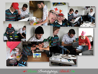
We came together around 1.30 PM, drank some coffee and tea and immediately started discussing some of our main issues, namely gameplay and the 3 different sections. After some inventive use of props like chairs and vacuumcleaners, we cleared these issues in a matter of minutes. Most of the time was spend smoking, drinking and spamming each other with "yo momma" jokes.
Here's a collage of some of the pictures made today, I think it may make some sense then :P
Not unimportantly, here's the paper prototype. Here we tested multiple angles, testing what is interesting (or not). Or what we can do at fast turns, for example. It's all still very open.
And finally, here's a videoclip of some brainfarts. Viewer discretion is advised (it also may smell funny), because there are some explicit clips of stupidity displayed. But hell, we had a lot of fun and made some very important decisions today. Yeah!
maandag 27 april 2009
First tryout Cardboard
Hey dudes,
Here's a first attempt of making our idea in real life. I didn't made any real designs here, just went for the feeling. It was quite fun, although I learned that cardboard can be a tricky medium to work with.
The question is: Are we gonna use the characteristics of cardboard in our game? I mean, the grainy texture is a no-brainer, but its sturdiness, slight flexibility, its multiple layers etc? Next to the look of the game it will also affect other areas, like the animation department. I guess we'll discuss tomorrow ;)
donderdag 23 april 2009
Moodboard Stage Progression: Feel
woensdag 22 april 2009
first sketches character Niels and I
Character Moodboard v0.1
Basic setup!
Moodboard "Adventure"!
dinsdag 21 april 2009
maandag 20 april 2009
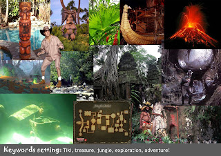
Moodboard Tiki Tiki!
Hey guys,
Here's my Tiki Moodboard. Everything we came up today is in there. It's still a bit broad, but nonetheless excitin!
I tried to incorporate lots o' stuff, like surf culture and imagery, the Tiki statues, the world famous tacky Tiki Bar signs (maybe useful in the game), the aesthetics from the fifties (hot rods, adverts etc.) and some Tiki "architecture", like huts. This can become somethings very interesting!
Hope you like it! Comments are very welcome.
zondag 19 april 2009
Moodboard en Visualisatie
1st Moodboard Stijl
Abonneren op:
Posts (Atom)